

17-11 Nishi-cho Yonbancho
Kanazawa Ishikawa
920-0914 JAPAN
Owner: Toshiaki Yamagishi
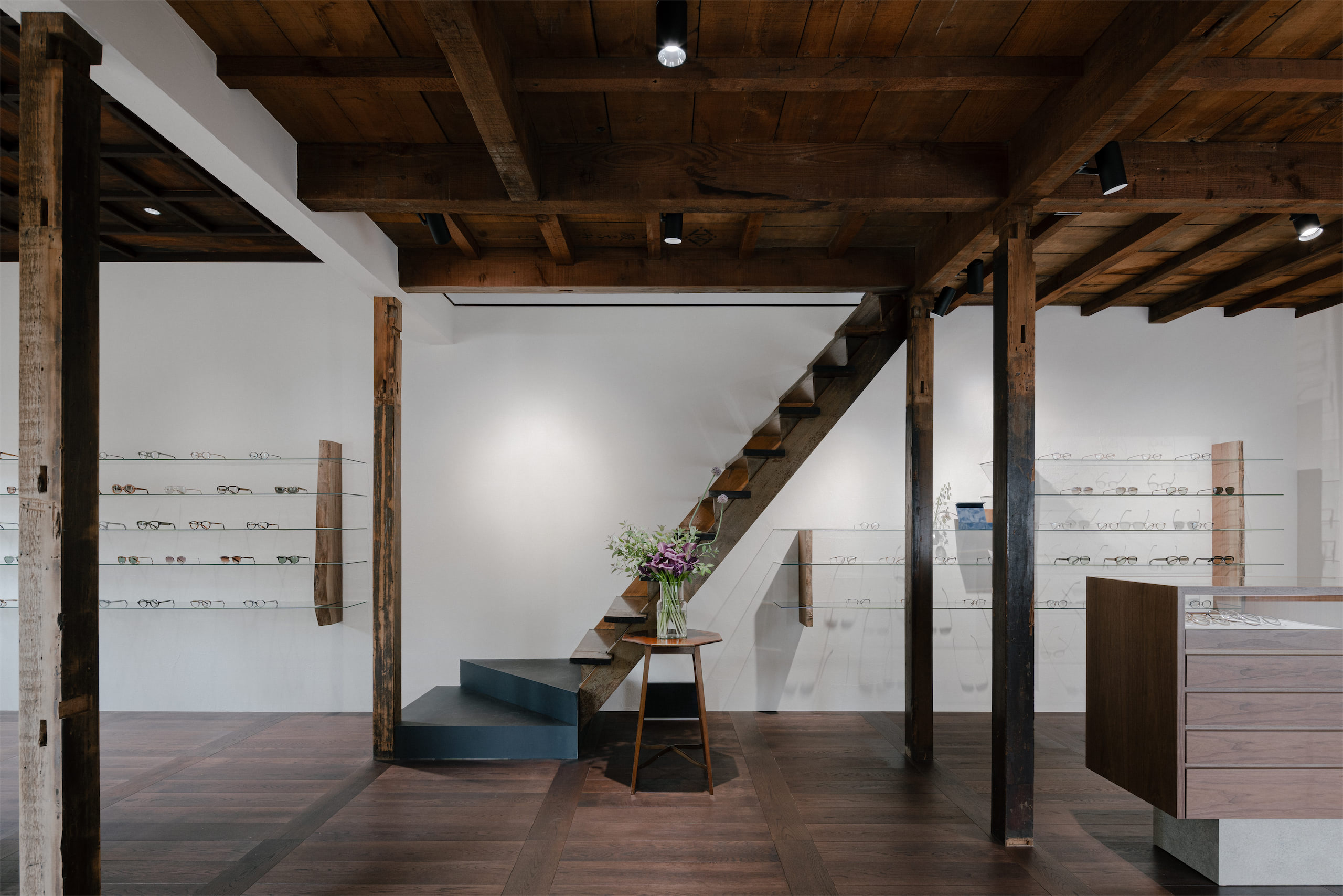
Mr. Yamagishi, we've known each other for a few years, and it's a pleasure to interview you. You own YELLOWS PLUS an eyewear collection I love so much. You recently opened this space called COLLECT, that I find amazing. Why this name, and what inspired you to set up an optical store?
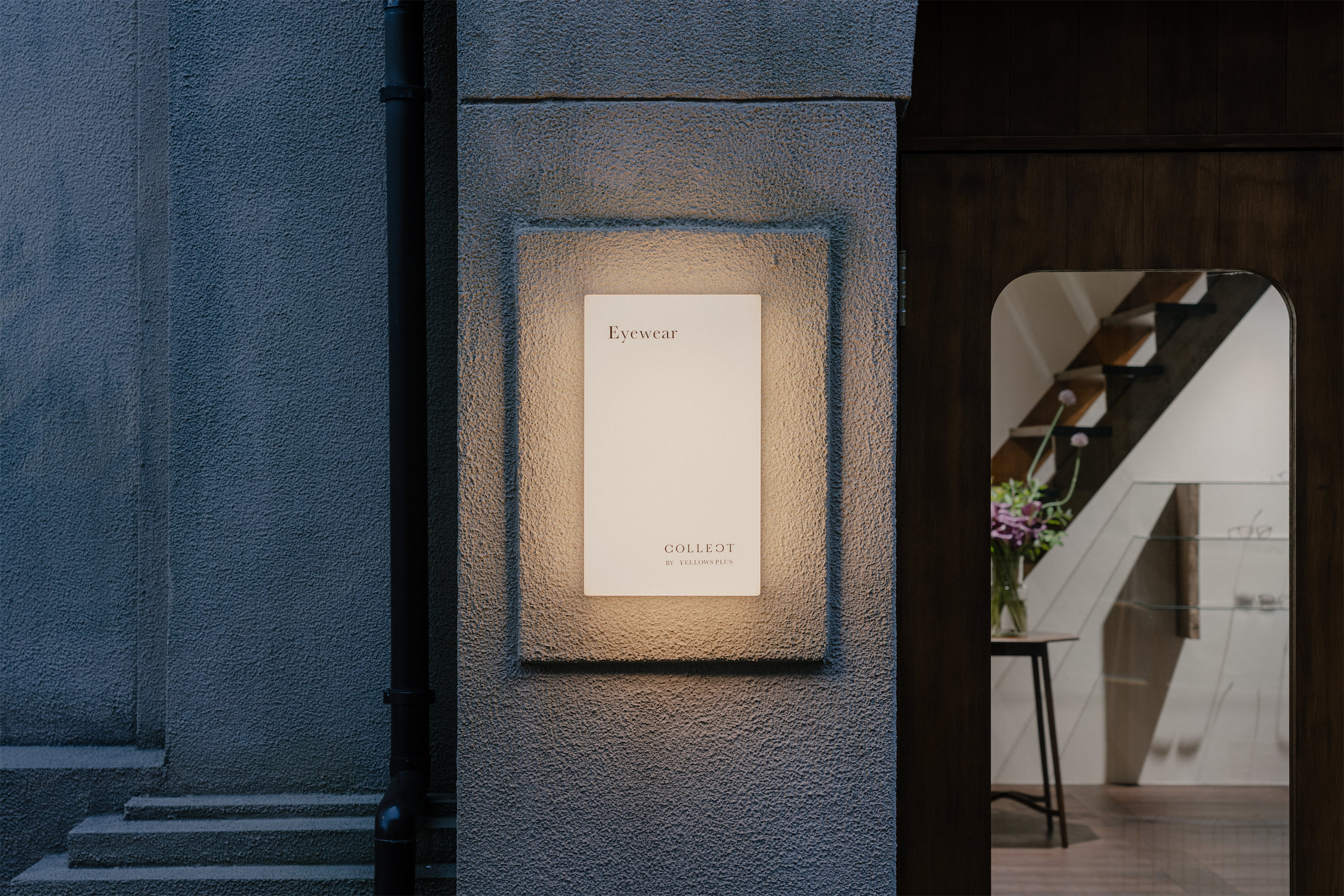
‘COLLECT’ conveys the meanings of gathering, selecting and showcasing.
While bringing together everything we have continued to create over the years, the items you can actually pick up and experience will be left to the moment of that day. Through a carefully selected range of products, we hope to create a space where everyone can connect with and appreciate what makes YELLOWS PLUS uniquely ‘itself’.
Eyeglass making is a meticulous process, where many components are crafted through the hands of different artisans and gradually brought together along a careful, deliberate path.
We see this very process of production itself as a form of ‘COLLECT’.
The idea behind opening this store was to share the world of YELLOWS PLUS through the eyes of the people who create it.
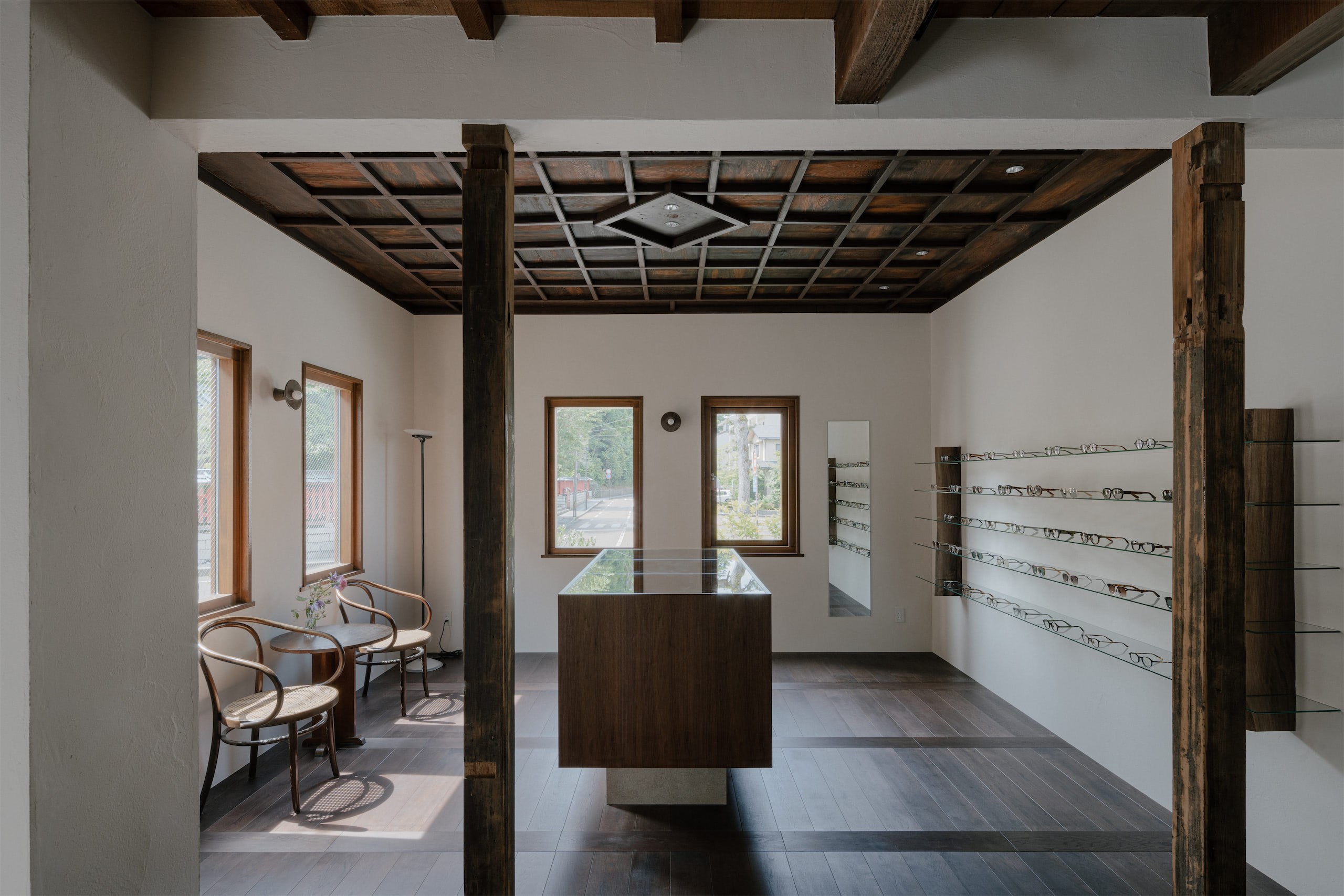
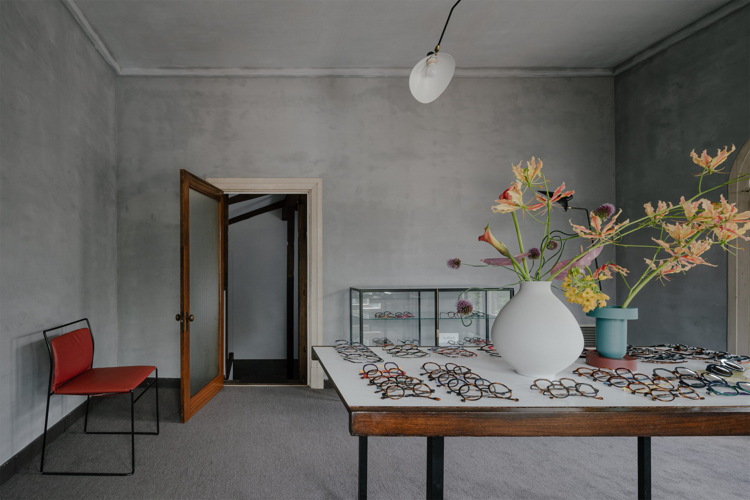
The environment has a very relaxing atmosphere. Who took care of the interiors and what materials were used and why?
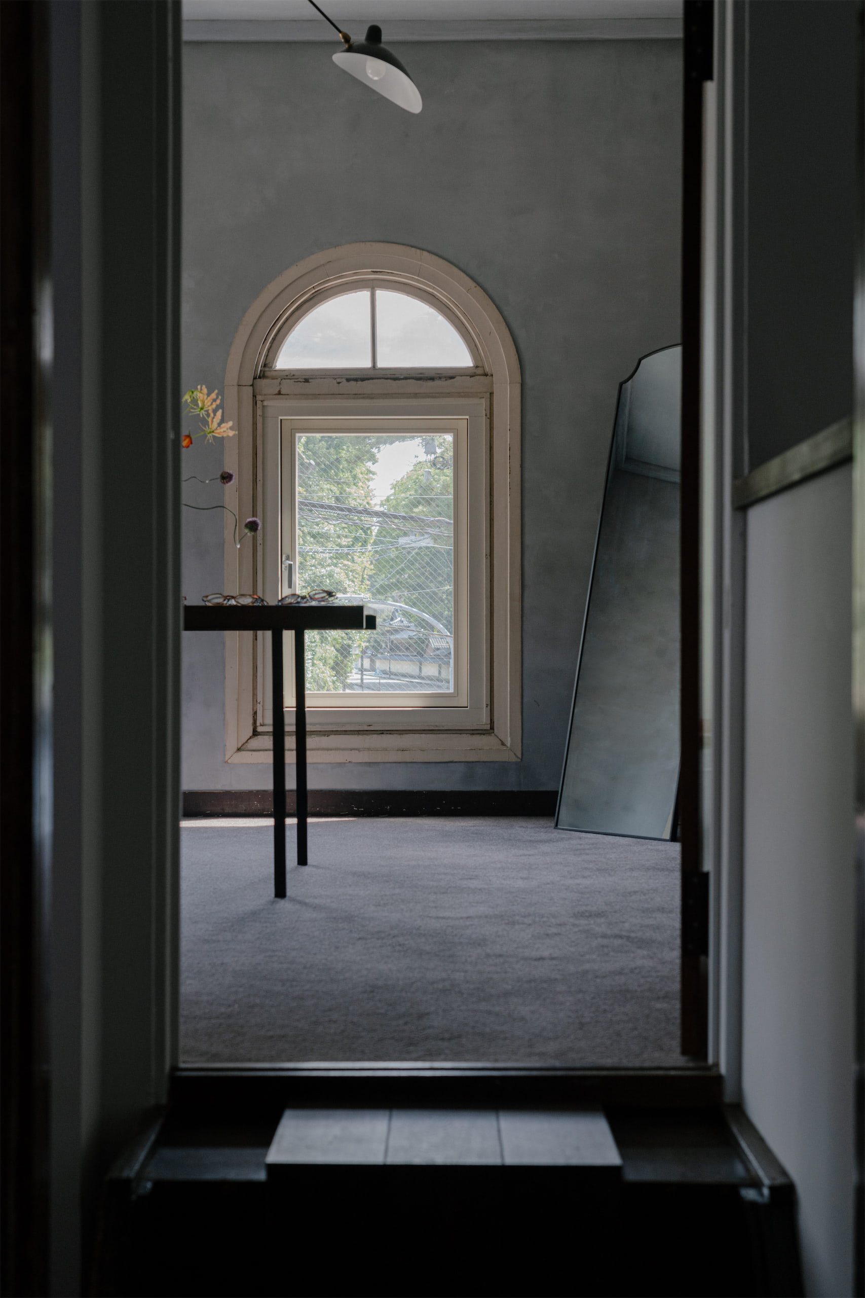
We designed the space to be modern and comfortable while preserving as much as possible the character of the original wood and walls of this century-old building.
Respecting what already exists and carrying it forward into new value – this is also a philosophy that lies at the core of our craftsmanship.
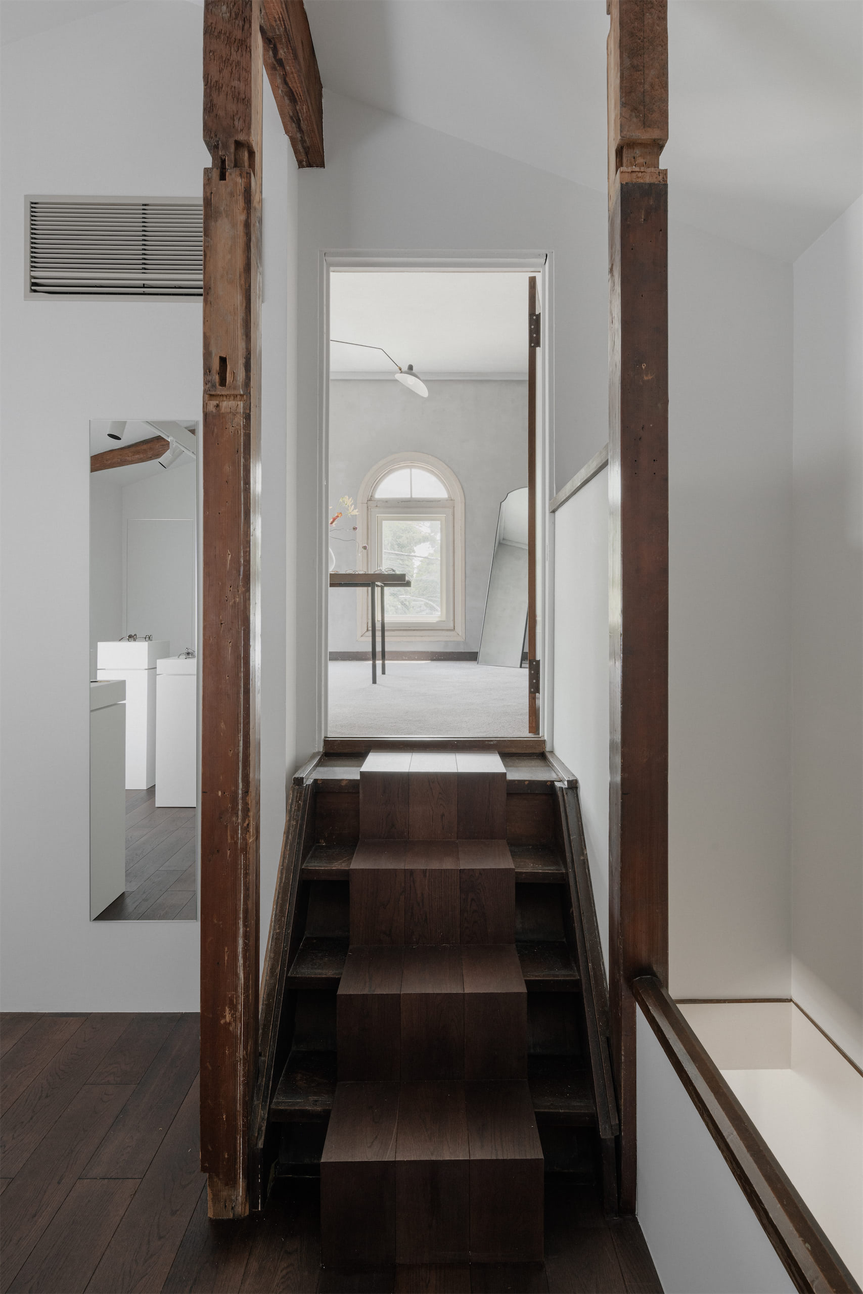
What were the inputs and sources of inspiration that guided the stylistic choices in the creation of COLLECT?
It reflects a uniquely Japanese sense of beauty, rooted in the traditions of Japanese craftsmanship.
How important are precision, harmony and essentiality to you, and how crucial was it to convey them within COLLECT?
Eyewear design is ultimately based on functionality, even if that is not always obvious at first glance. Achieving a balance between form and function requires both precision and harmony.
What is routine work for us can sometimes become a special experience for our customers. At the same time, understanding their thoughts and expectations is an extremely valuable opportunity for us.

Read more on the hard copy

1F, 1-43-9 Tomigaya, Shibuya-ku
Tokyo 151-0063
JAPAN
Owner: Tetsuya Okada
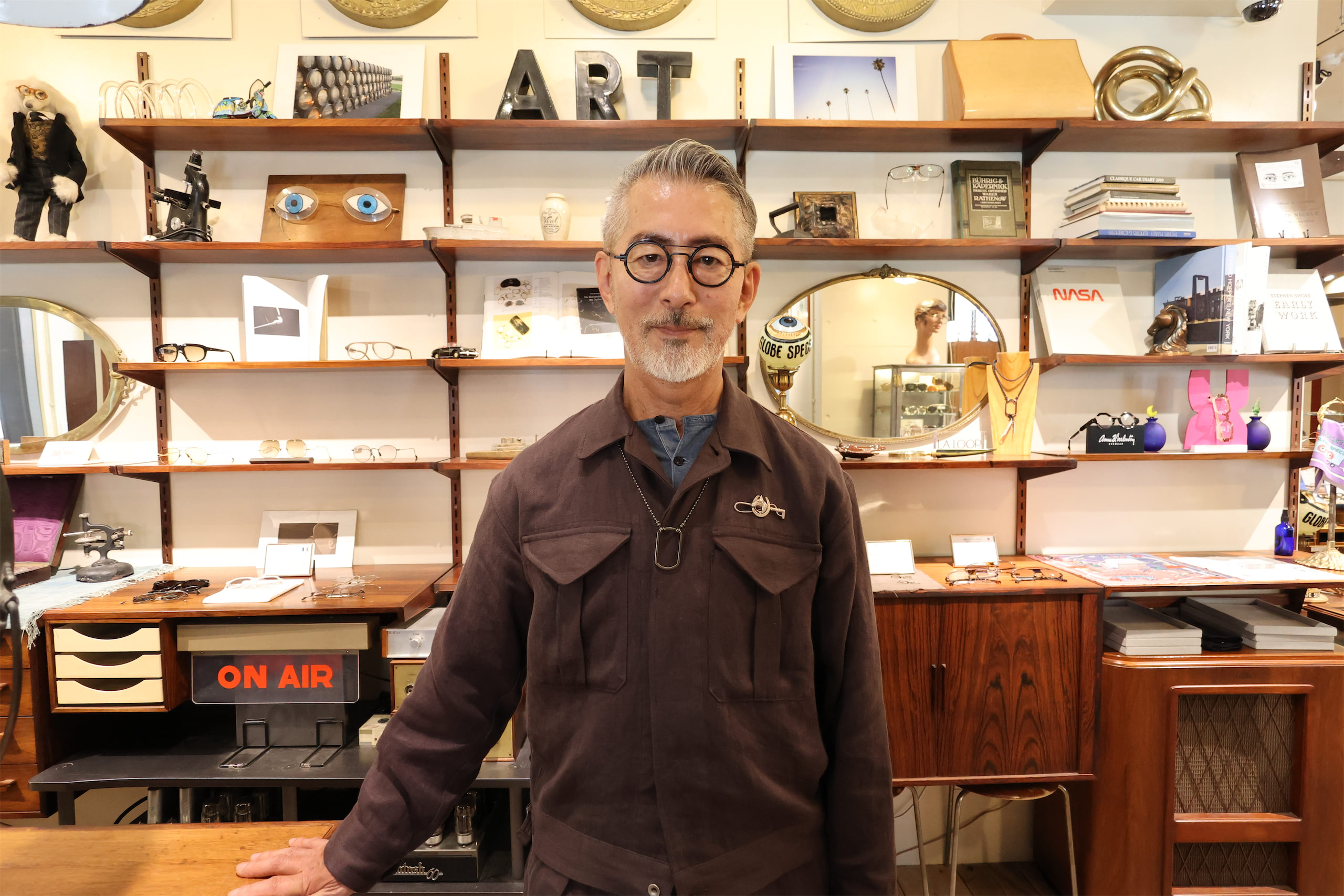
Tetsuya Okada – The Vision Behind GLOBE SPECS: An In-depth Interview
Tetsuya, we've known each other for some years now, meeting up around the world, but often in a rush. We've already had the pleasure of hosting you inside LYF, but now, on the occasion of the relocation of your Shibuya store to a new neighborhood, I'd like to take some time to explore your path and the influences that shaped it in more depth. In your new space in Shibuya, you intentionally evoked the atmosphere of New York. Why is this city so dear to you, and how has it shaped you?
New York has been my second home, a place that fundamentally opened my eyes to the world, to a new language and culture and taught me to believe in the possibilities to go on in the eyewear world, giving me a fresh perspective on life.
I lived there twice:
Childhood (age 10): attending elementary and junior high school during the anti-Vietnam War and hippie movements (e.g., Woodstock). This first experience was profoundly impactful, introducing me to foreign language, culture, racism, fashion, and new ways of living, enabling me to communicate in English and broaden my perspective beyond Japan.
Early career (age 27): I transferred to an optical subsidiary in the mid-1980s. I had entered the industry believing eyewear could be a fashionable item, not just a visual aid, but felt this vision wasn't shared in Japan. Moving to New York allowed me to pursue this dream. This was the era when brands like Alain Mikli, Lafont, Matsuda, and ProDesign were emerging, and New Yorkers were receptive to these design movements. I managed a temporary store location and experimented with introducing these new brands, innovative displays, stronger fashion statements for staff, and revised client consultation methods. This experimental, short-term store remarkably surpassed the sales of the 20-year-old main store, solidifying my belief in the possibilities of eyewear and laying the groundwork for GLOBE SPECS.
Furthermore, I was drawn to the medical and academic side of optometry. The robust licensing and learning opportunities in the US led me to become a certified optician, strengthening my professional knowledge and confidence.
Returning to Tokyo, you will have brought with you a different perspective: how has your idea of style changed in the transition between these two cities?
After returning to Japan, I joined another major optical retail company and worked as an assistant to the president, engaging with many European brands and designers. This led to extensive travel across Europe, where I observed store designs and eyewear from Scandinavia, Benelux, and Southern Europe. This broadened my understanding of eyewear design's history and potential. I met inspiring people and saw innovative ideas, including the successor designer of Arne Jacobsen's architect office, who invented the Air Titanium (later Lindberg). Collaborating with this office, I won the prestigious Japanese industrial design competition, the ‘Good Design Award Grand Prize 1992’. Before founding GLOBE SPECS, I accumulated a wealth of amazing experiences and encounters with innovation and great minds in Europe. Which later on leads to establishing the GLOBE SPECS Aesthetic and Philosophy.
Can you tell us something about how you designed and furnished this new GLOBE SPECS space in Shibuya and what your intent was?
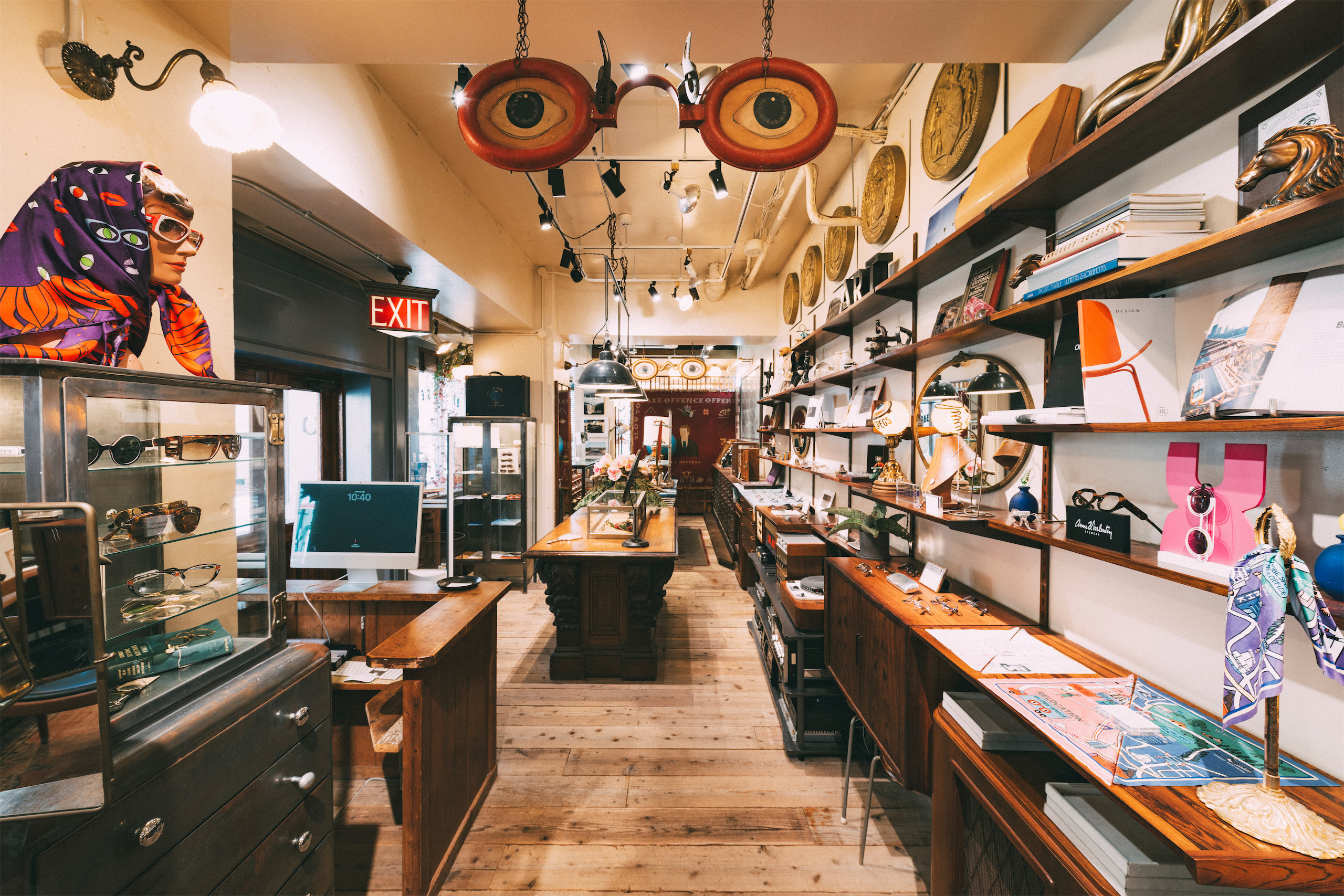
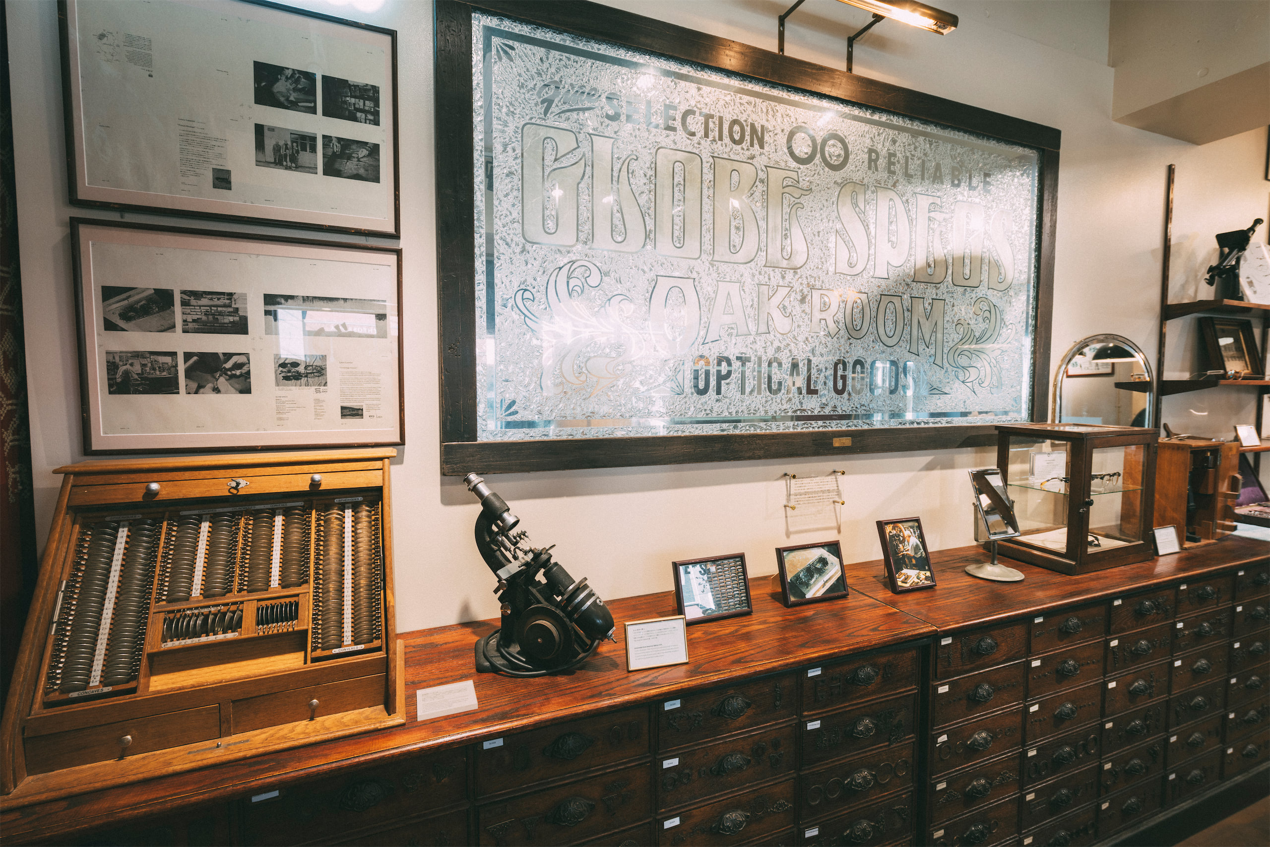
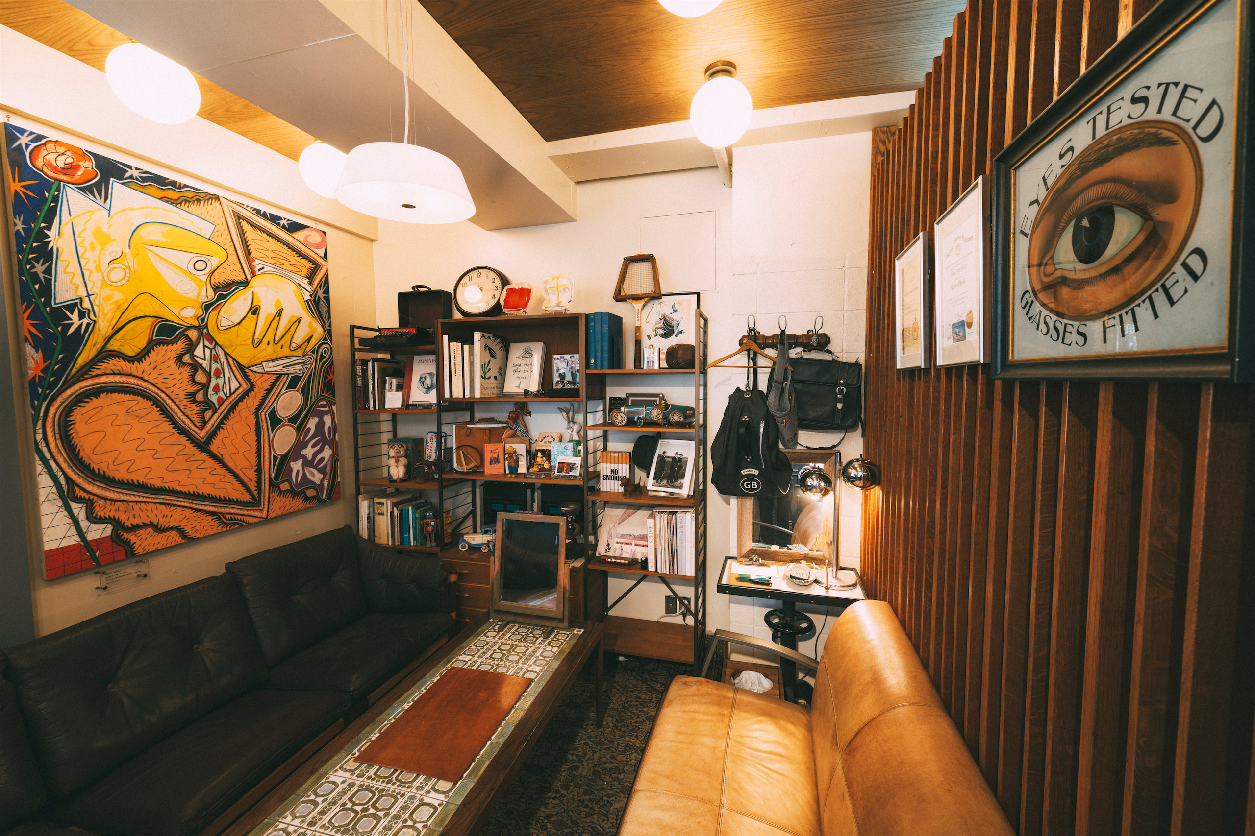
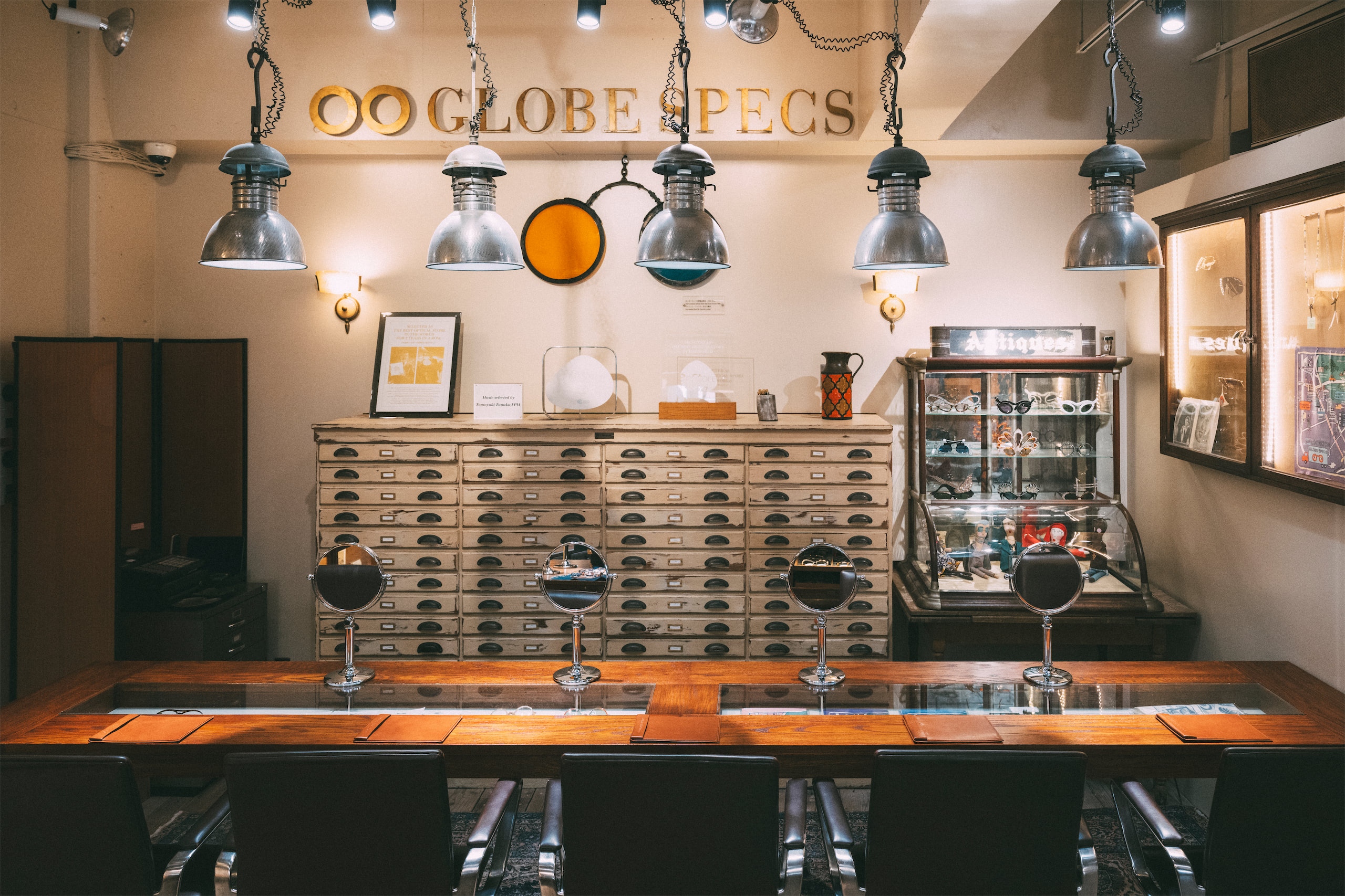
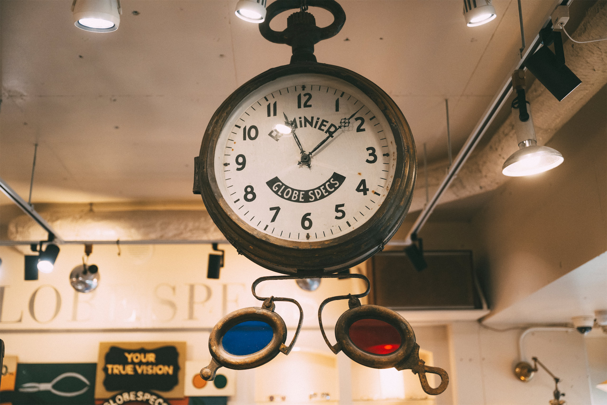
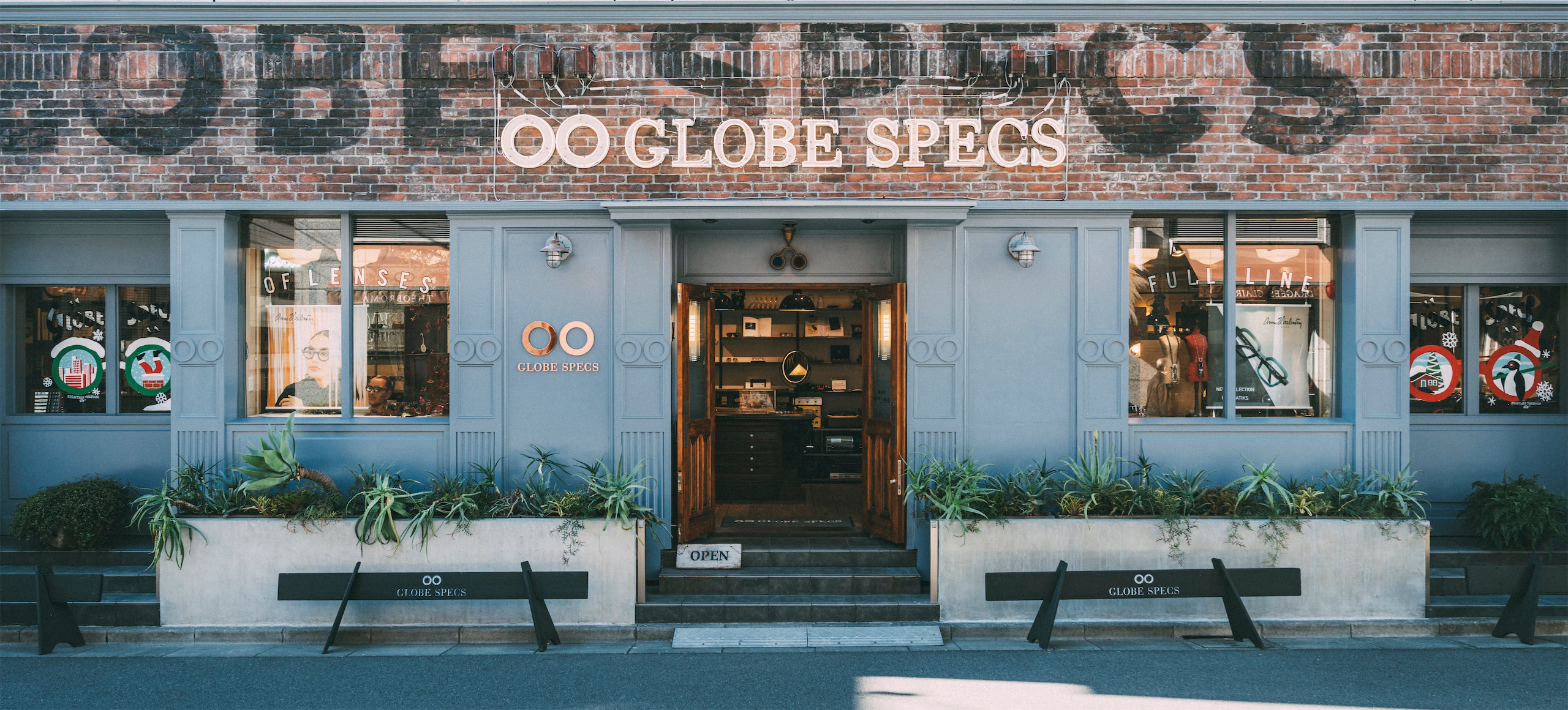
After 27 years in the Shibuya Jinnan area, its atmosphere as a fashion center changed, prompting our search for a new location. We found a great space in Tomigaya, an area I always admired. The location was formerly a reputable design firm whose director had been designing GLOBE SPECS store up until the Kyoto store. I had always admired the firm's stylish and distinctive atmosphere, and we were fortunate to inherit the walls, wooden floor, and lightings from this firm.
All GLOBE SPECS stores are furnished with vintage and antique pieces that I collected over the years, making the Shibuya store a kind of GLOBE SPECS furniture museum. For example, we still use the glass/iron cabinet from our first store in 1998, originally used in the first Prada store in Japan. The new Shibuya store balances this old, familiar GLOBE SPECS atmosphere with completely new, impressive furnishings to offer a fresh impression and new discoveries for our clients.
Read more on the hard copy

11, Pirundae-ro, Jongno-gu
Seoul
REPUBLIC OF KOREA
Owner: Aiden Kim
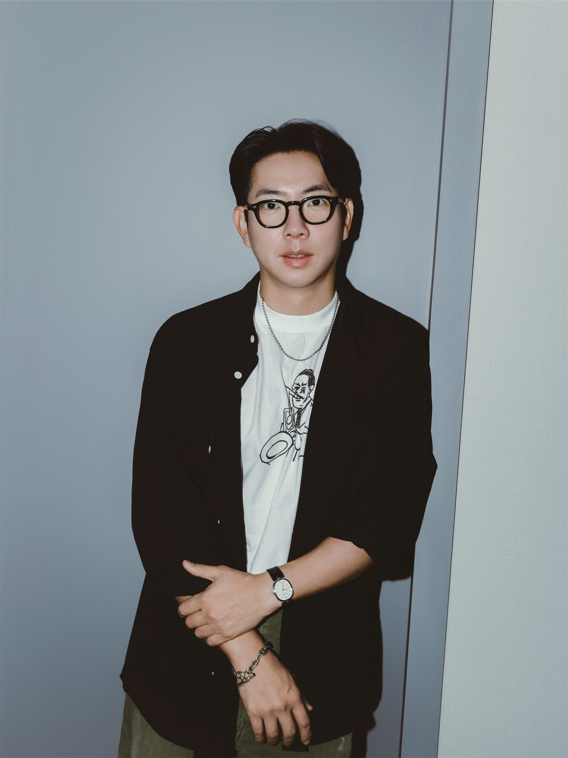
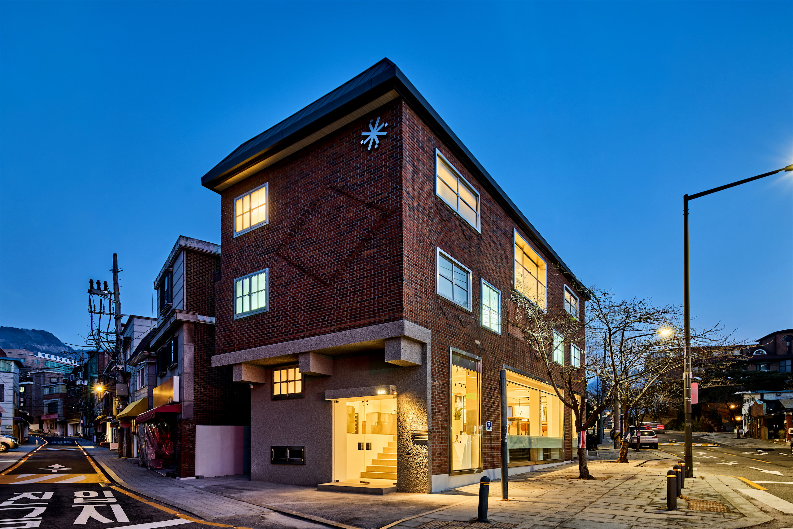
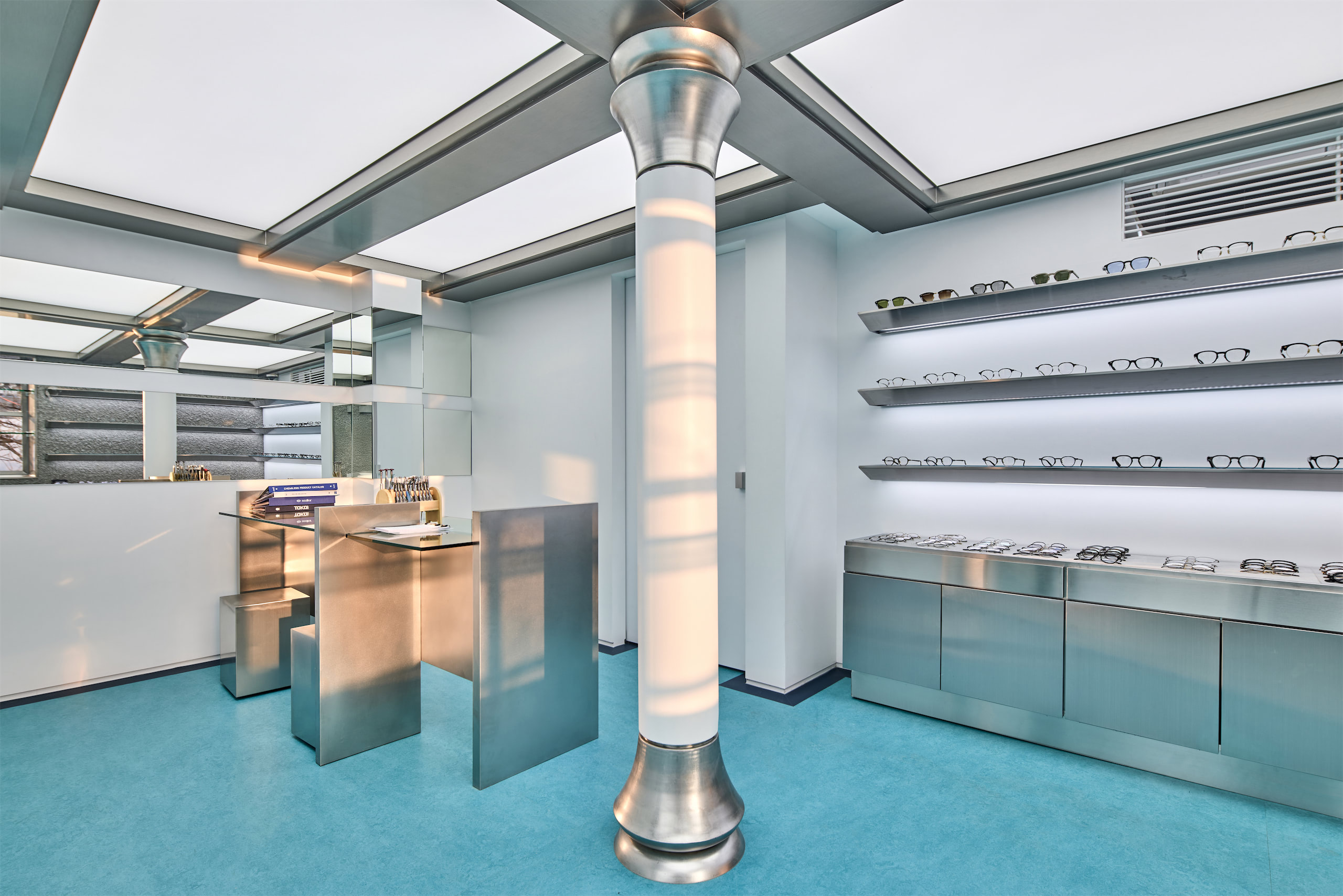
Aiden, it's a pleasure to interview you. EDIT.SEOCHON is a very interesting space. Looking at the exterior and interior, you can note a beautiful contrast. Tell us about your store, how it came about, and what inspired you to open it in this neighborhood.
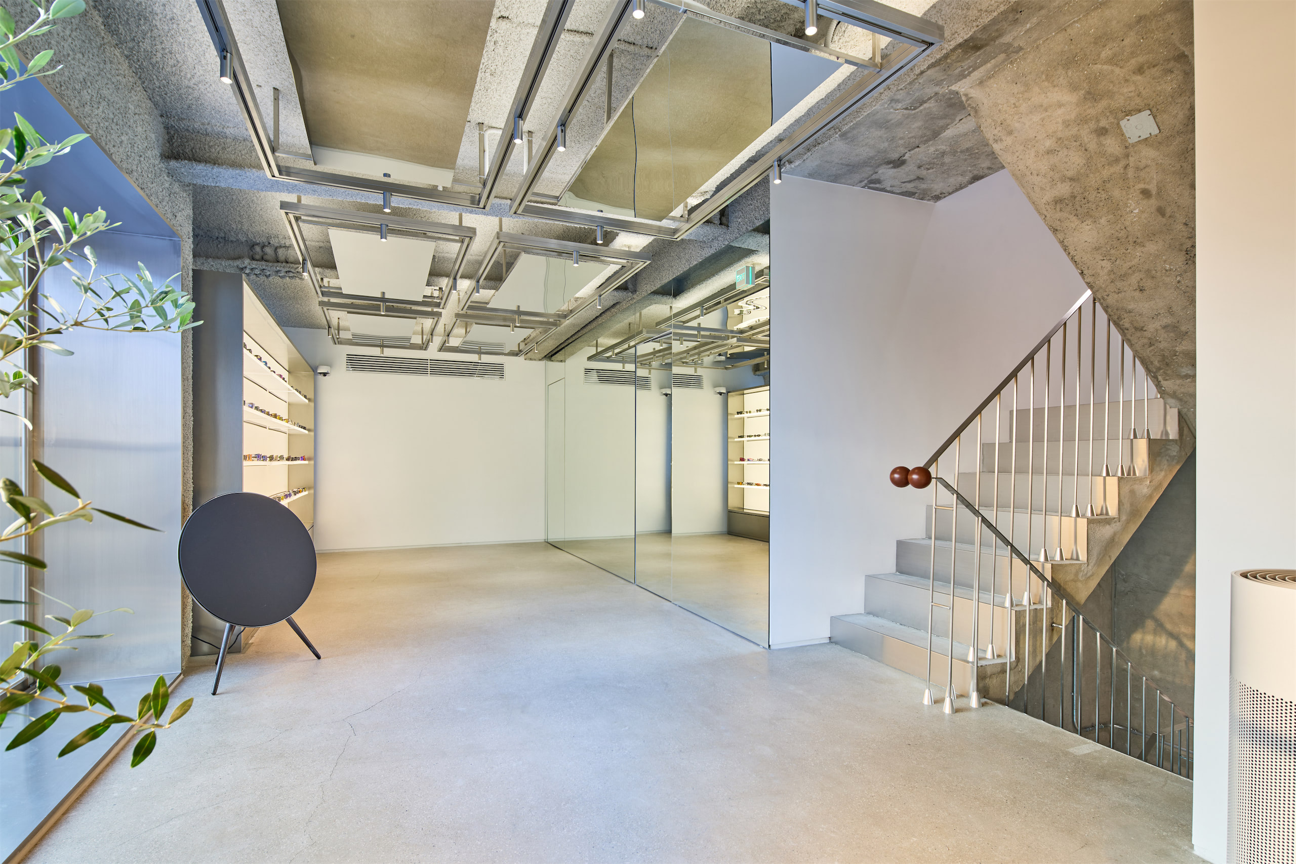
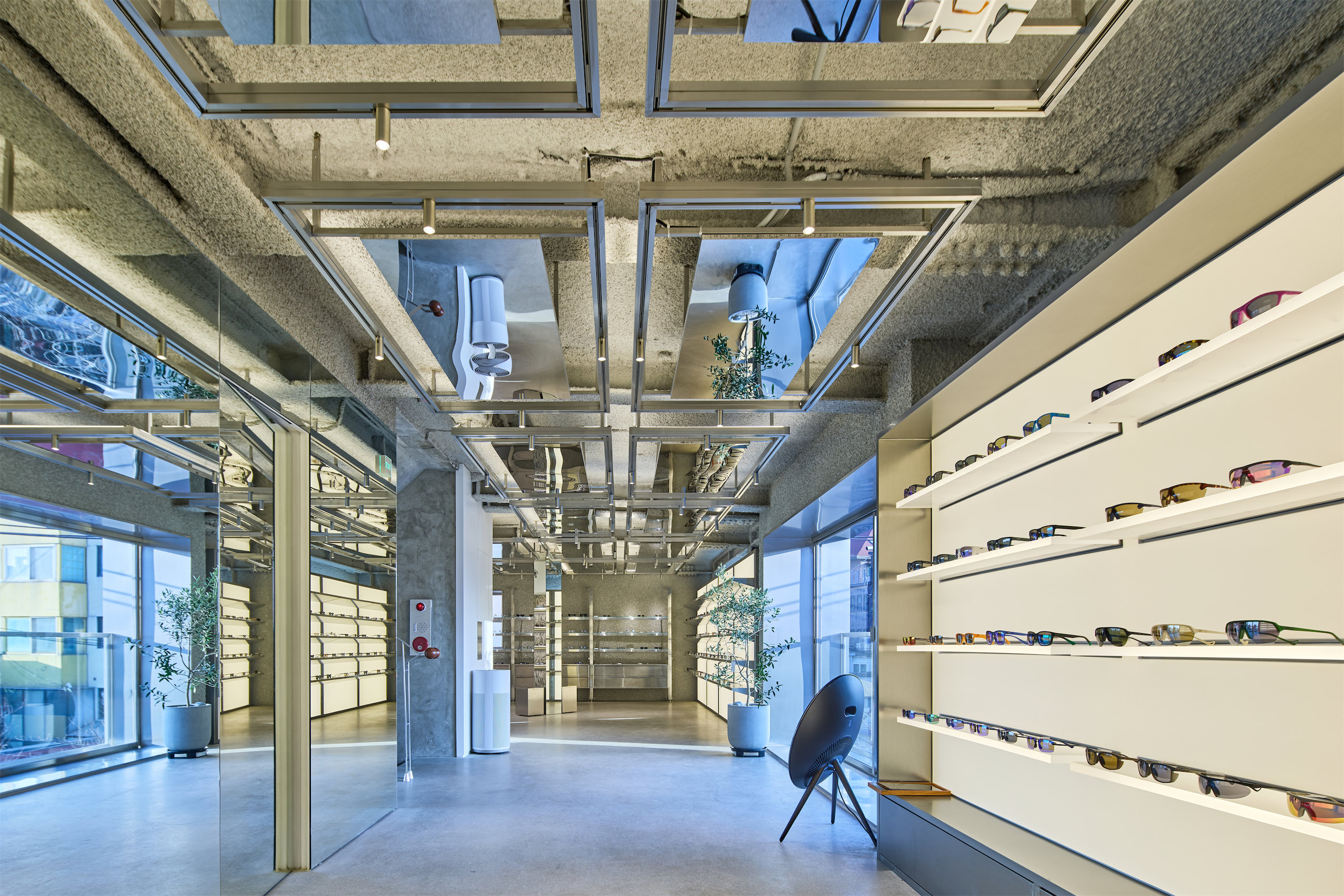
EDIT.SEOCHON was conceived not simply as a retail space, but as a curated environment where eyewear could be experienced beyond its functional role.
From the beginning, I was interested in presenting eyewear not as a seasonal product, but as something closer to an object of design – something that carries proportion, materiality, and a sense of permanence.
Seochon felt like the right place to begin. It is a neighborhood where layers of time coexist – traditional architecture, independent galleries, and contemporary culture.
This coexistence reflects how I approach eyewear: balancing heritage with a modern point of view.
Rather than creating a purely commercial space, I wanted to build an environment where people could slow down, observe, and experience subtle differences – in form, in material, and in how something sits on the face.
In that sense, EDIT.SEOCHON is not just a store. It is an attempt to reframe how eyewear is seen, and ultimately how it is chosen.
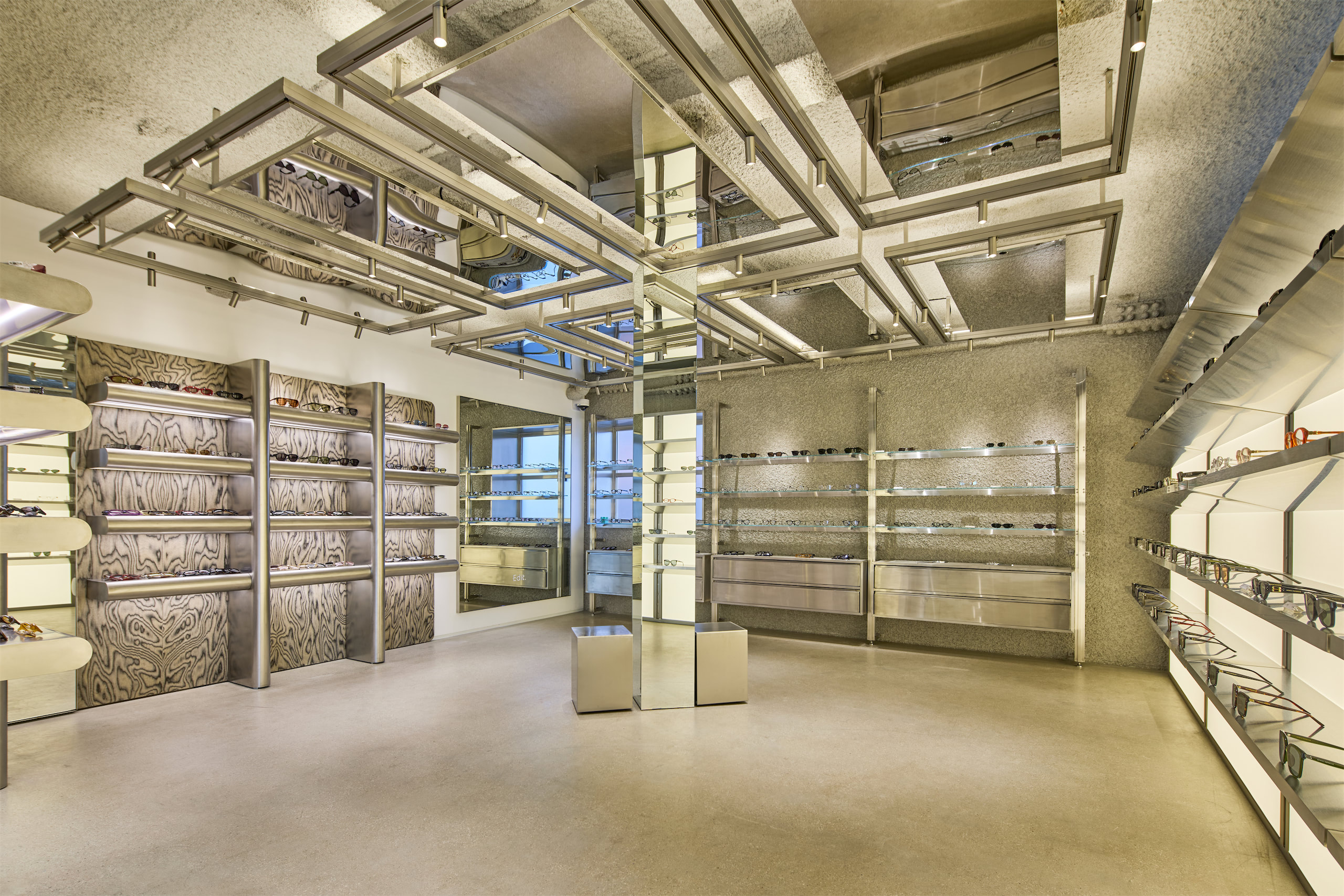
Why the name 'EDIT' and what is the meaning of the star-shaped symbol you chose?
The name ‘EDIT’ reflects a way of thinking rather than a fixed identity.
Eyewear, to me, is not something that is simply chosen – it is something that is edited. A process of refinement, of removing excess, and selecting what remains with clarity.
Each letter carries a meaning that forms this framework:
Eyewear that matters.
Design that defines.
Identity through selection.
Taste over trend.
Together, they describe how we approach curation – not by following what is visible, but by filtering what is meaningful.
The symbol is often perceived as a star, but it is actually derived from an ARK auto refractor, a device used in optical examinations.
Before a full examination, the machine projects light into the eye to capture an initial measurement – a moment where vision begins to take form.
This idea of light was essential.
Rather than creating a decorative mark, I wanted the symbol to represent the beginning of clarity – the point where perception starts to align.
By translating this functional element into a visual form, the symbol becomes a representation of precision, light, and focus.
In that sense, it reflects what eyewear should ultimately do – not only change how you look, but refine how you see.
Read more on the hard copy

112 Little Collins Street
Melbourne VIC 3000
AUSTRALIA
Owners: Emma Buckley and Dr Natalie Boffa
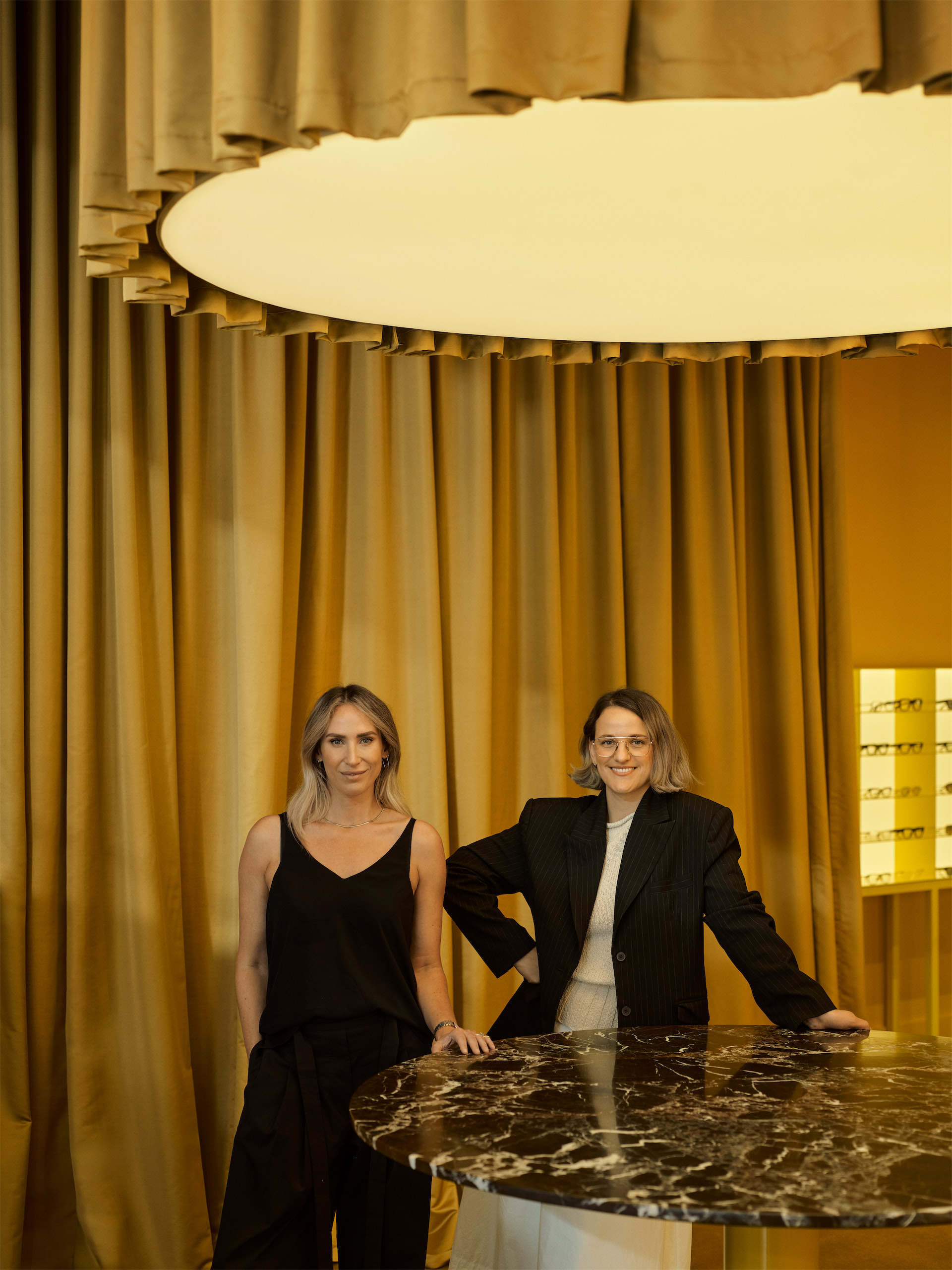
How was Six Six born and why did you choose this name?
Six Six came from a very simple but deeply held belief: that eye care and eyewear should feel as considered and inspiring as any great fashion or hospitality experience. We'd both spent years in our respective fields: I worked in eyewear wholesale across APAC and previously a dispenser for over a decade, while Natalie worked in clinical optometry and multidisciplinary ophthalmology settings. We kept arriving at the same frustration: Optometry in Australia is deeply clinical and lacks warmth or beauty. We wanted to build something that held both, unapologetically.
The name is rooted in vision. SIX SIX is the metric equivalent for perfect vision (20/20), the clinical standard used in optometry to measure visual acuity. We liked the duplication, the sexy letters, and how it is precise and meaningful without announcing itself. It reflects something we think about constantly: clarity in every form. Not just in how well someone sees, but in the environment we create, the way we communicate, and the intention behind each decision.
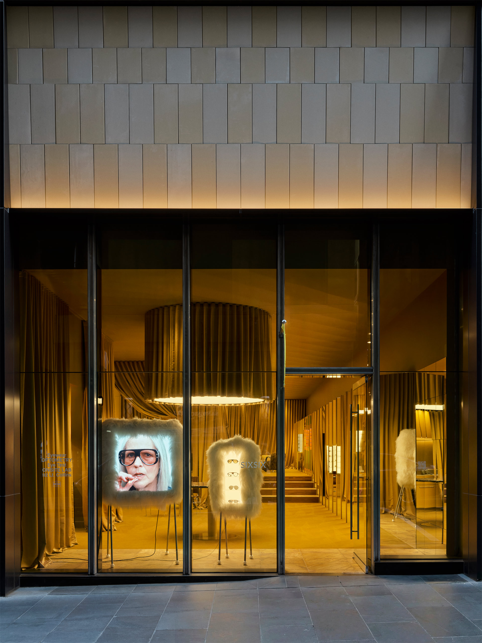
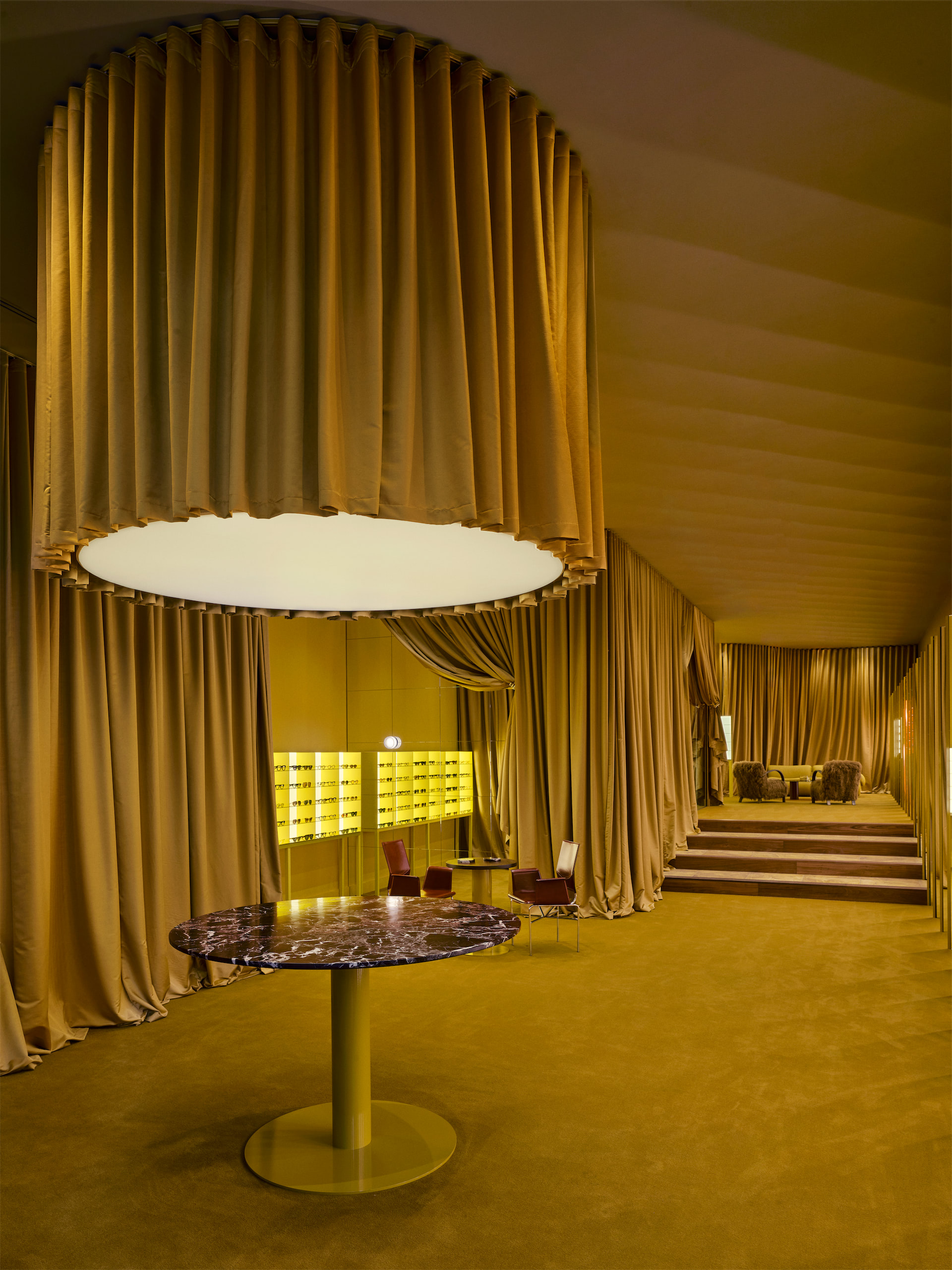
The space intrigued us greatly… Where did the idea for such an immersive space come from, and what artistic and cultural references inspired its creation and identity?
We worked with Kennedy Nolan on the interior, the brief focused on feeling, not just function. We didn't want a clinic with a nice frame selection, nor did we want a boutique that happened to have an optometrist in the back. We wanted a third element: a space with its own logic and atmosphere, somewhere that slowed you down the moment you entered.
The references were wide. Hospitality as much as retail. Theatre. We were drawn to spaces that feel edited, where what's left out is as deliberate as what's included. There's a softness in the material palette, the light, and the acoustics that we hoped would create something almost protective.
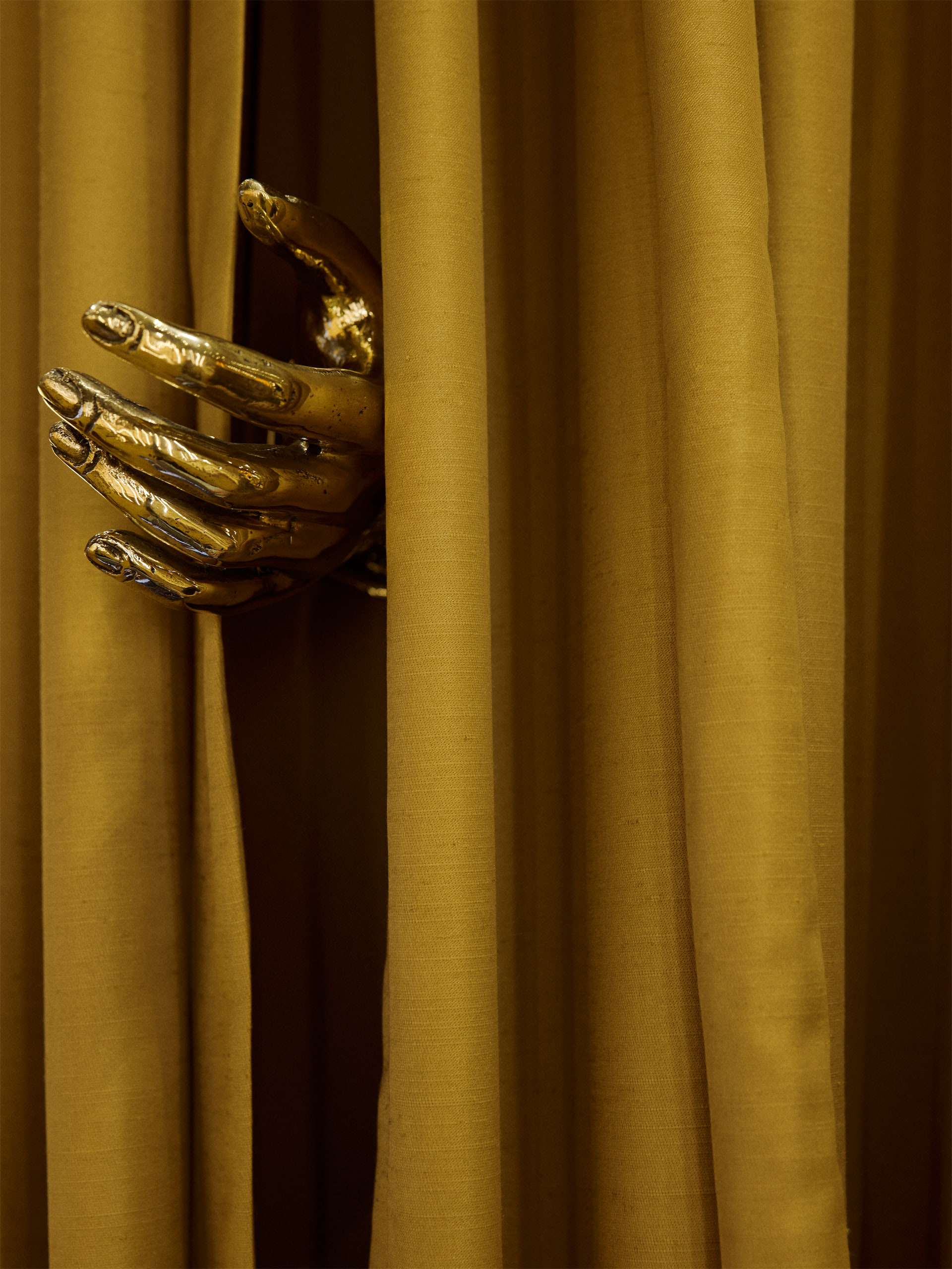

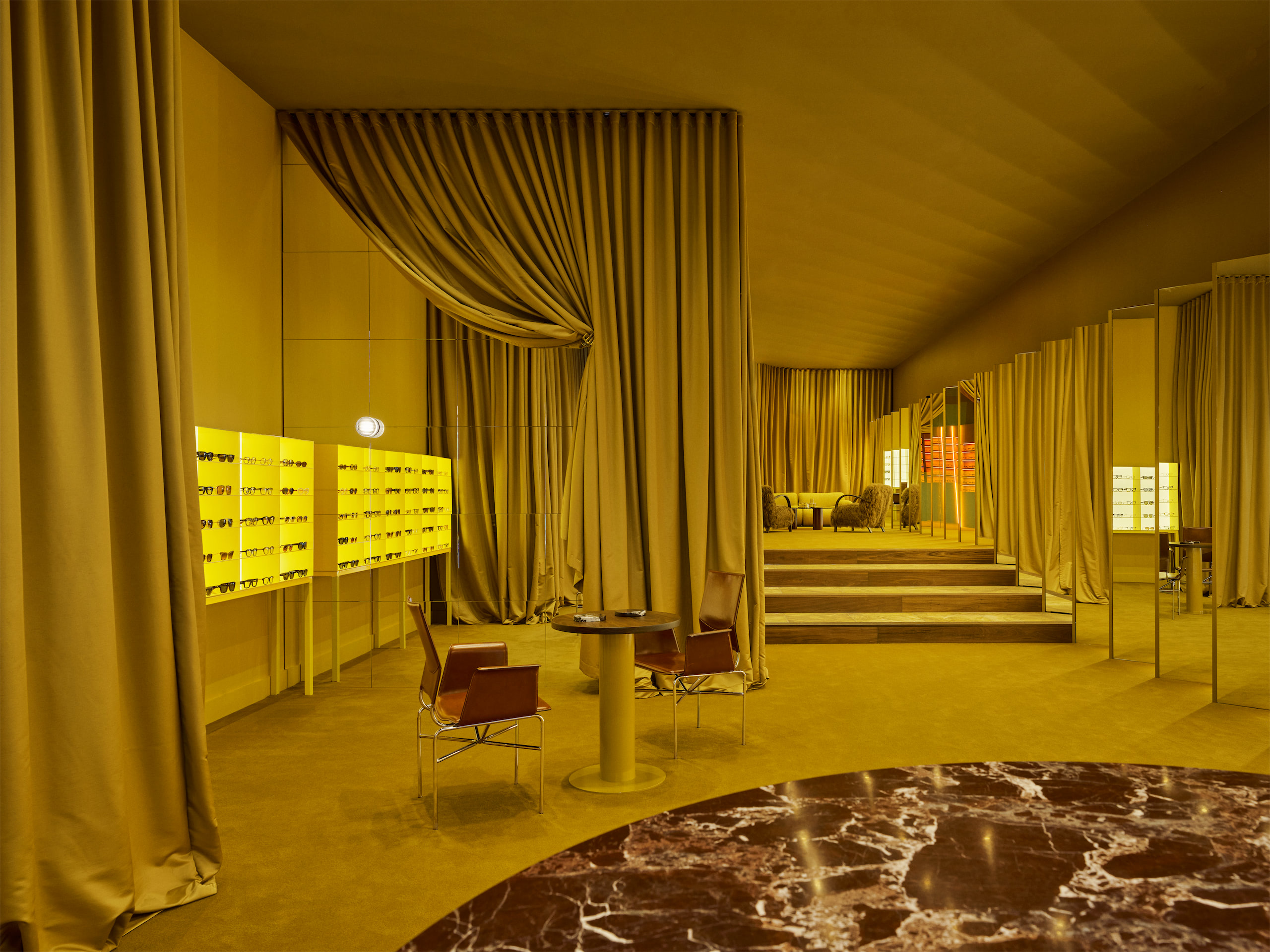
Curtains aren't just decoration: they seem to become architecture, separation, movement, transforming the perception of space. Why this choice?
Curtains carry a kind of theatre that hard architecture never quite manages. They move. They change with light. There's also something inherently human about fabric, it absorbs sound, it softens edges, it makes a room feel inhabited rather than constructed.

Read more on the hard copy

Nägelihof 1
8001 Zürich
SWITZERLAND
Owner: Kai Müller
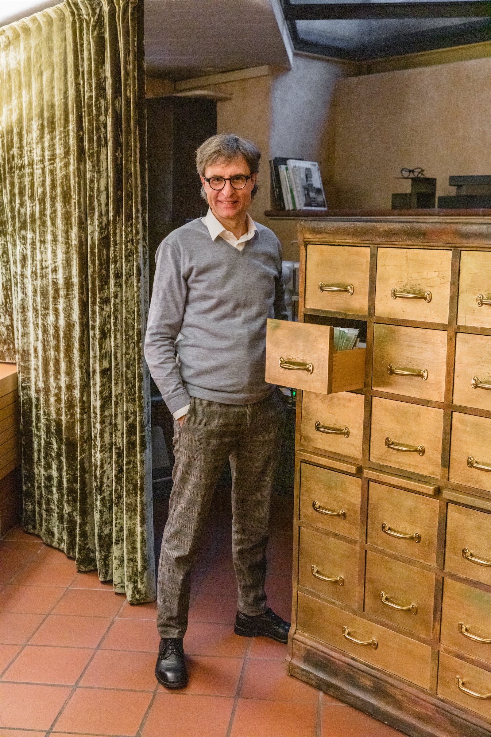
Kai, Alpenglühn began as a wonderful adventure – and also a challenge – between two partners who wanted to change the rules of the market in their City. Would you like to tell us about it?
The way things were done in the industry at the time didn't meet our expectations at all: too rigid and impersonal. We wanted to create a relaxed atmosphere and build a relationship of trust with our customers, completely free of white coats and technical jargon. Each eyeglass frame deserved its own place. What is the norm today was almost unthinkable back then.
For us, it was essential to dedicate time to people: taking their needs seriously, valuing them, and providing personalized support. Our quality standards were very high, from the way eyeglass prescriptions were written to the quality of the finished glasses.
We had clear ideals and we applied them consistently. Initially, we gave ourselves two years and saw it more as a project, with the unknown of what would emerge. We never could have imagined that something so special would come out from there.
In 1999, we also founded our own trading company, Alpenglühn Handels GmbH, and as distributors we were able to experience another facet of our industry.
The word ‘alpenglühn’ must have a special meaning for you. Why did you choose it? What message did you want to convey?
The name was a very bold and unconventional one for an optical shop at the time.
'Alpenglühn' – Alpine Glow – embodies our philosophy in a unique way. It describes the natural phenomenon in which the warm light of sunset reflects off the rocky faces of the mountains in a fiery red glow.
On the one hand, it is a physical phenomenon, and therefore a beautiful connection to optics. On the other, it represents an emotion we wish to convey: we don’t just want to open our customers’ eyes, but also touch their hearts and ignite their passion.
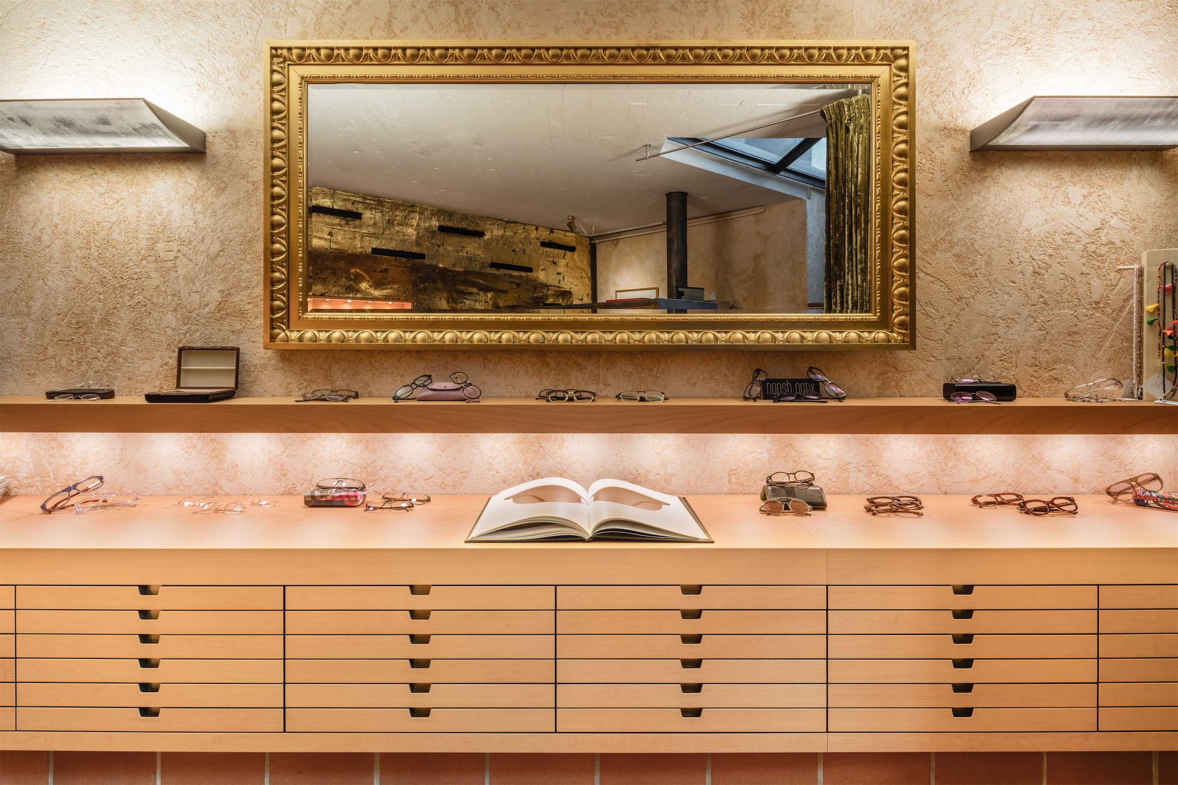
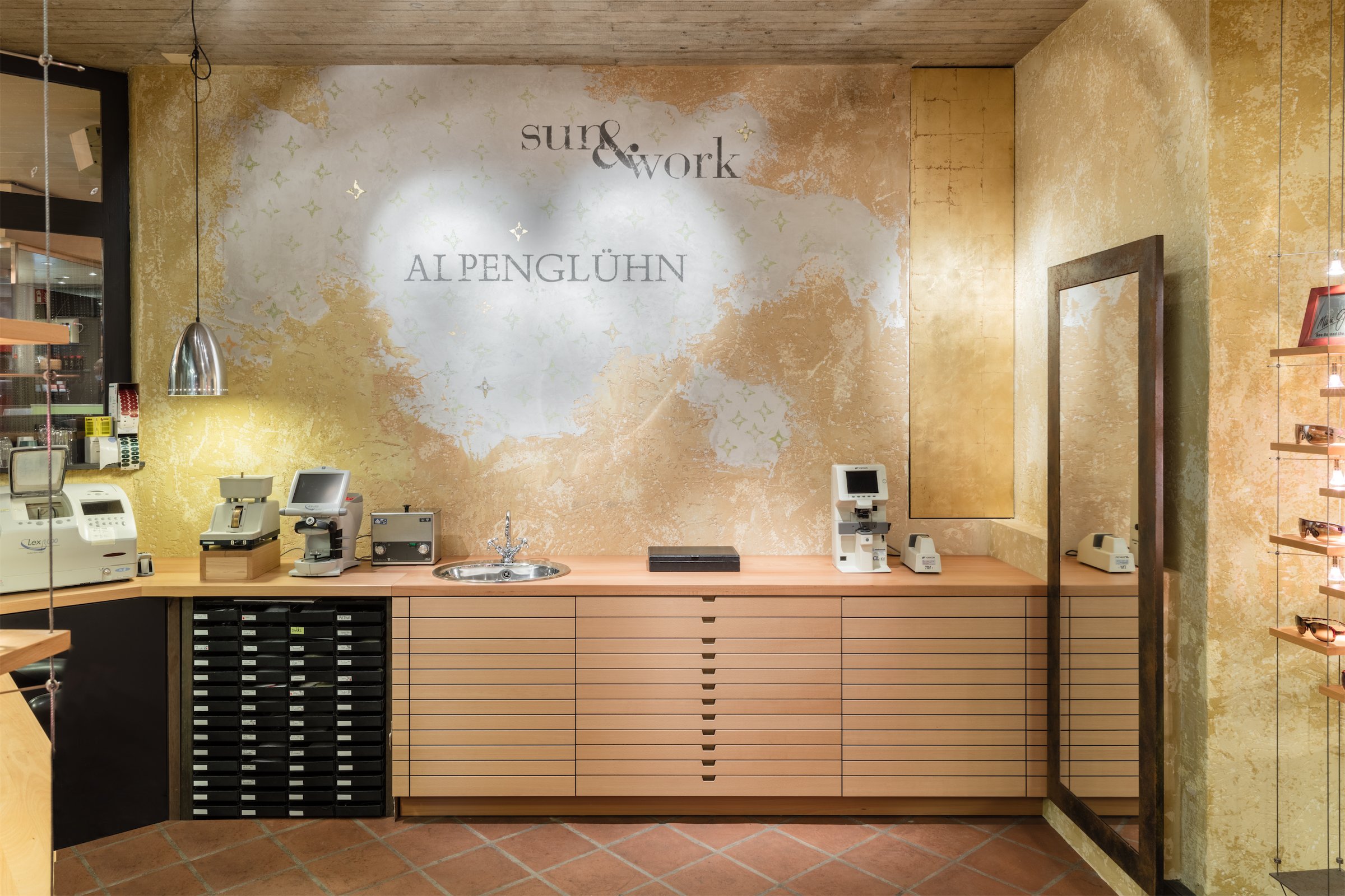
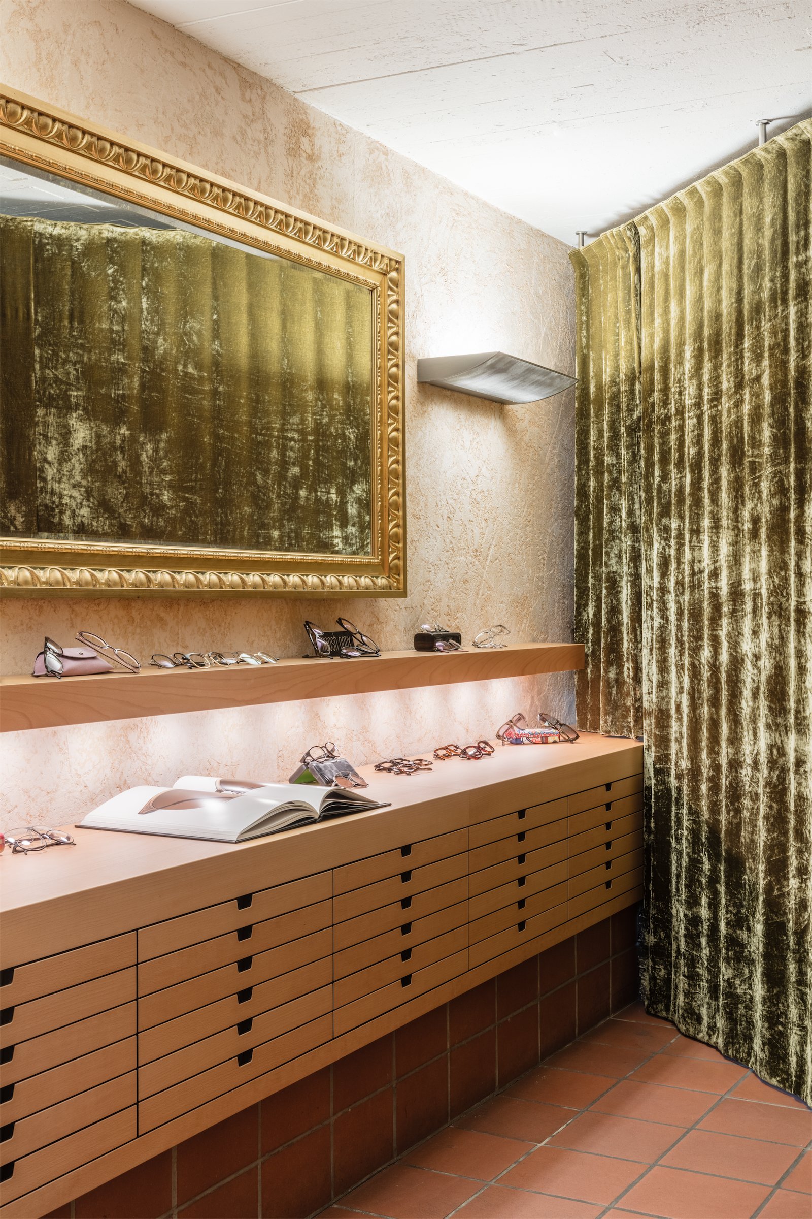
The interior of the store is truly particular. A basement with a golden wall is a bit disorienting, but the contrast is very interesting. How did you come up with the idea of creating your store this way? And what's the thought behind it?
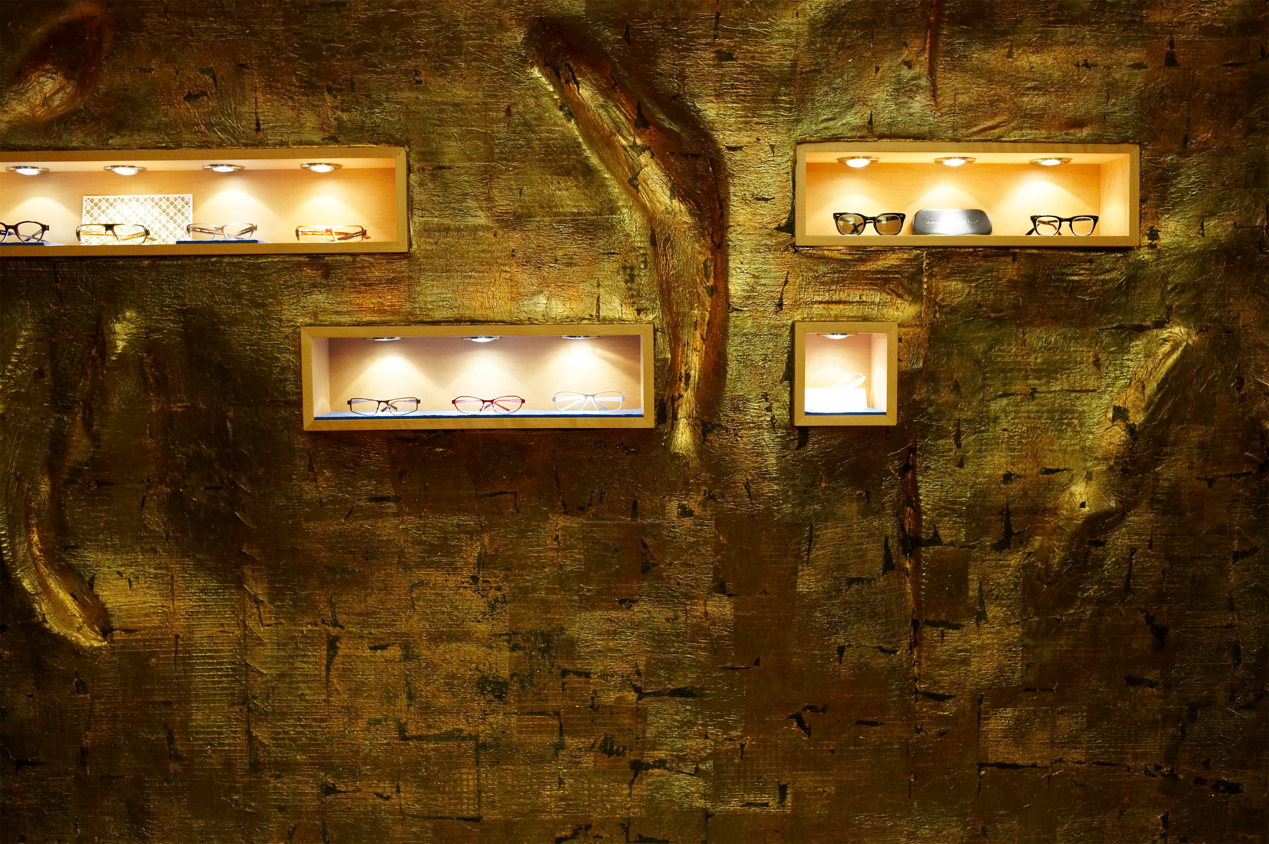
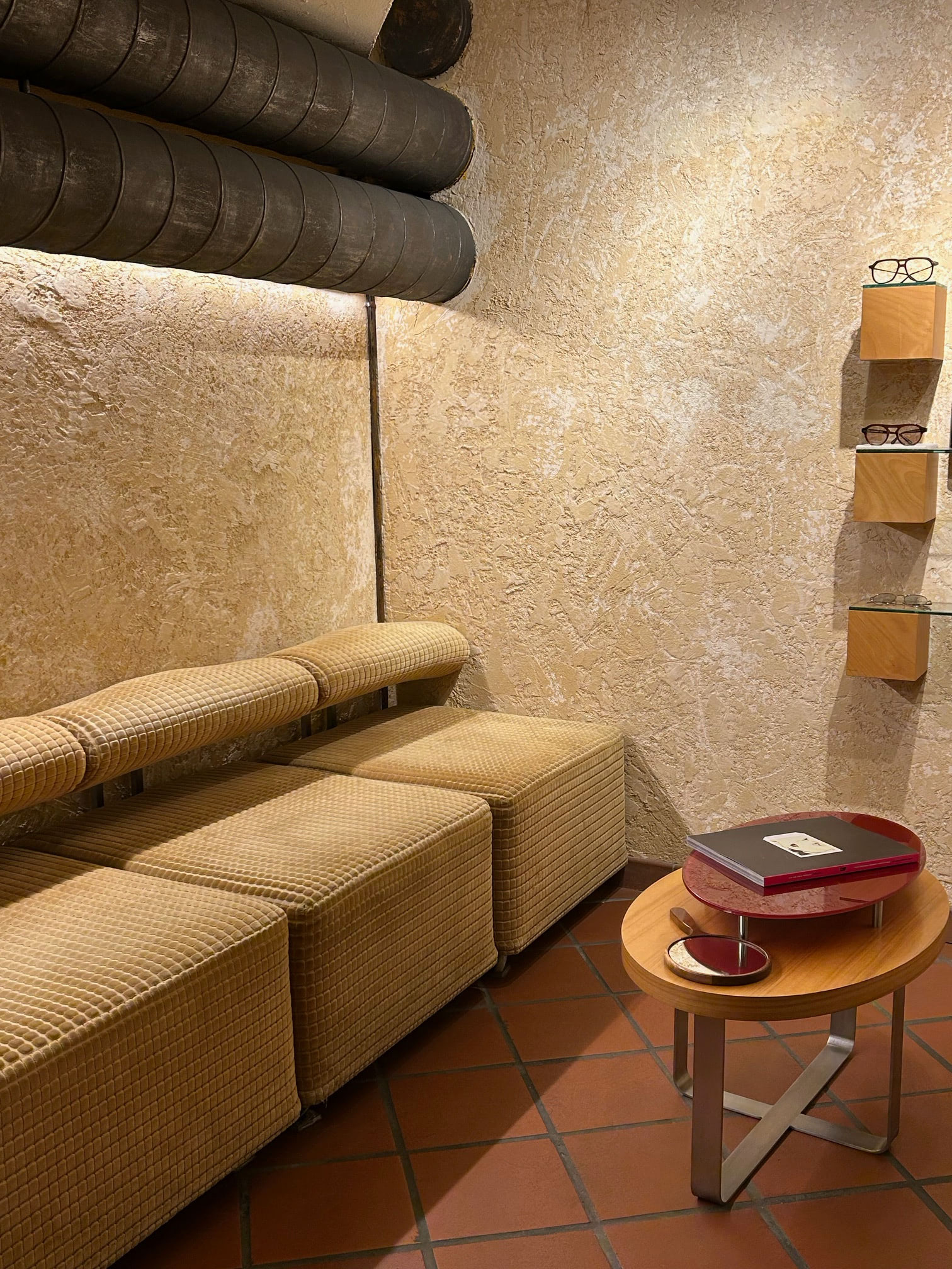
The golden rock wall reproducing the mountain is a central element of our guiding principle. The entire space was specifically designed to be warm and welcoming, so that our customers feel at ease, almost at home.
The materials used, such as wood and iron, symbolize continuity, clear values, and high quality. For us, it was important not to overcrowd the shop with glasses. Each frame has its own distinct presence and receives the attention it deserves.
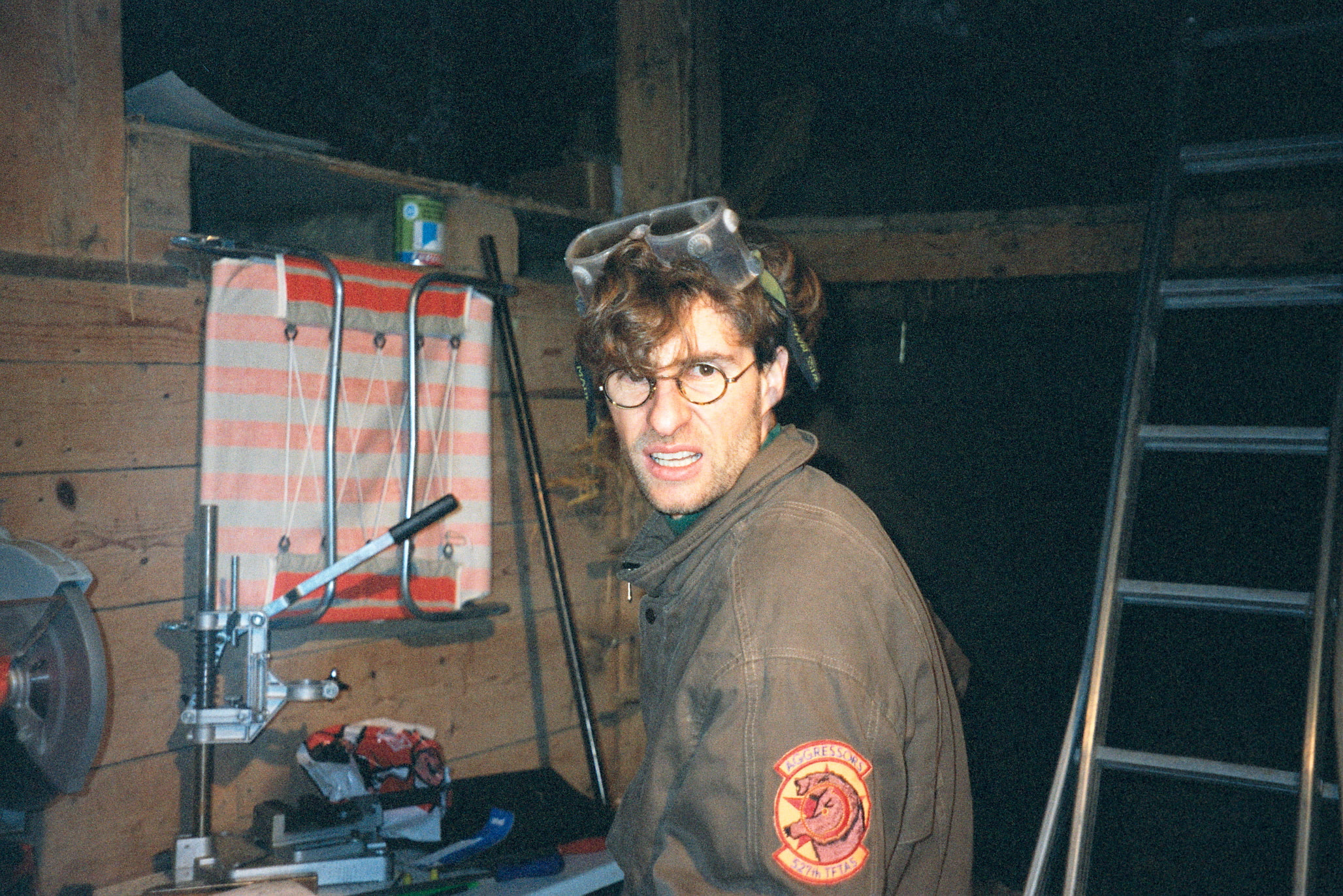
At the same time, Markus Moser and I wanted to showcase our consulting skills. Since our financial resources were initially limited, we did most of the work ourselves, with great dedication and creativity. The result is a unique look that clearly stands out from other stores.
Read more on the hard copy